
Media Kit
These media kit guidelines provide you with the rules to follow in order to properly make use of our brand.
By using our brand’s assets and media kit content, you indicate your acceptance of our usage guidelines and you understand that violation of these guidelines will result in the termination of permission to use these assets.
Our logo.
This is the logo that you should always use when referring to our company. We provide multiple versions to ensure legibility in various situations. The logo is stylized with a macron over the lowercase “o”, which symbolizes a long sounding “o”.
The logo is a universal signature we use across all our communications. We want it to be instantly recognizable, so consistency is important—please don’t edit, change, distort, recolor, or reconfigure it.
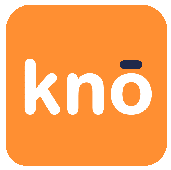
Primary Logo
This is the main KnoRe:Me Inc. logo and should be used in this style whenever possible.
Alternate Logo
This version works well as an alternate on dark backgrounds where the blue will not be clearly visible.
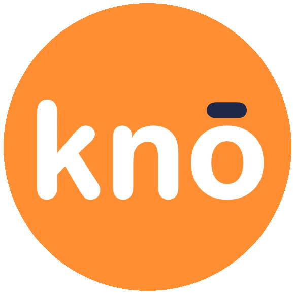
Rounded Logo
When the logo must be in a circle shape, this is how the main KnoRe:Me Inc. logo should be used.
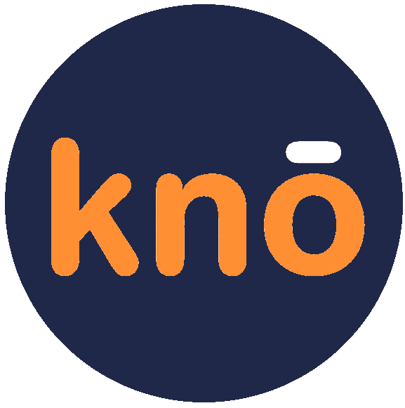
Alternate Round Logo
This version works well as an alternate on dark backgrounds where the blue will not be clearly visible.
Monotone Dark Logo
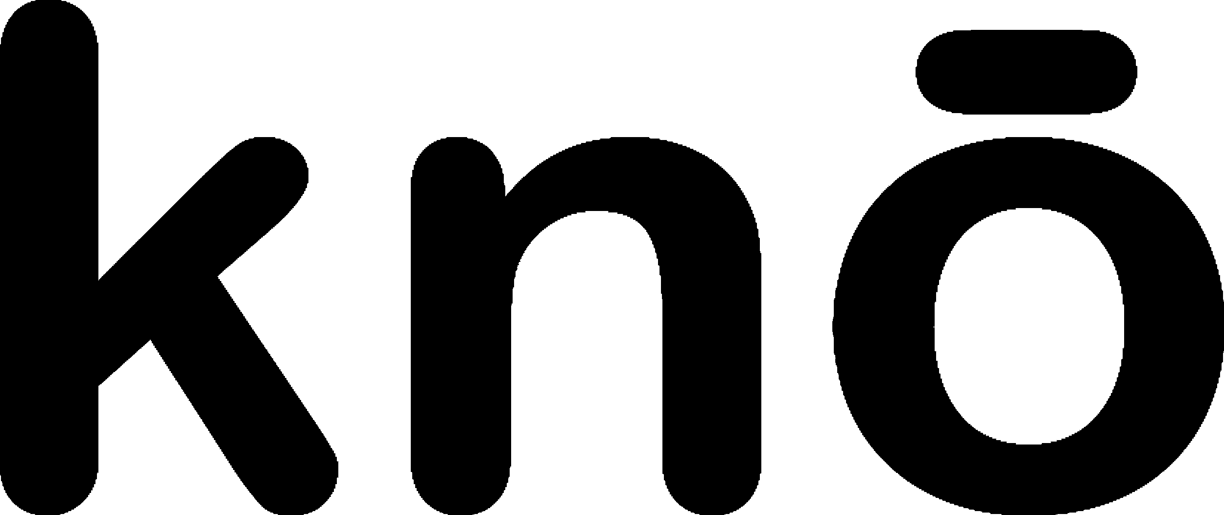
Color logos should always be the preferred choice. This monotone dark KnoRe:Me Inc. logo should be used, as a substitute, only when absolutely necessary, per the guidelines provided.
When can I use the monotone logos?
- When color is not an option or is too expensive to print
- Embroidered labels on apparel
- On top of busy photography when the full-color logo simply doesn’t work
- When you have a bunch of logos bundled up together and want a clean monotone look
Monotone Light Logo
Color logos should always be the preferred choice. This monotone white KnoRe:Me Inc. logo should be used, as a substitute, only when absolutely necessary, per the guidelines provided.
Our colours.
We use two main colours to portray the focus we have to running a company deeply committed to data privacy and security for our business clients and public consumers of our app, and the desire to free everyone from the mundane tasks of updating contact information to instead focus on friends, family and running their businesses.
The deep blue colour (#202D50) carries that gravitas, while the fun orange colour (#FF8F32) keeps things bright and happy. The secondary accent colour used is white (#FFFFFF).
Primary Dark Colour
Deep Blue
#202d50
Primary Accent Colour
Fun Orange
#ff8f32
Our fonts.
We primarily use two fonts in our applications and communications, Roboto and Montserrat.
Roboto is the main font used in our website.
Monserrat is used in places as an accent or for other purposes.
KnoRe:Me Inc is working to change how people connect and stay connected, by making the whole process easier and reduce the workload in our lives.
ENTERPRISE SERVICES
PRICING
AVAILABLE INTEGRATIONS
COMPANY
GET IN TOUCH
KnoRe:Me Inc.
78 George St, Suite 204
Ottawa, ON K1N 5W1
CANADA